Exploratory Data Analysis

Dataset 1 - Electricity Production
1) Identify time series components of data
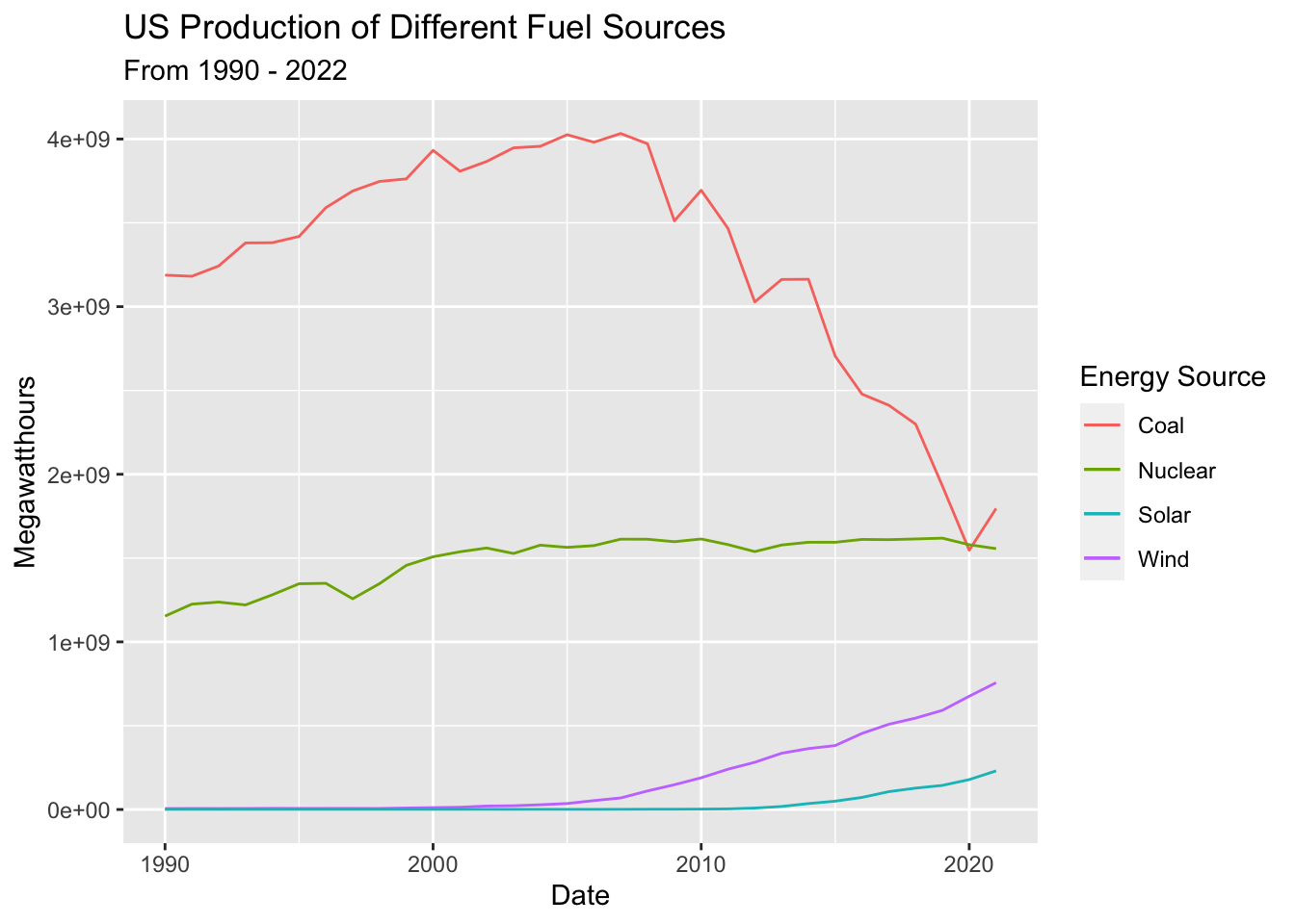
It is first important to visualize the time series at its most basic level. Electricity production data has been subsetted to include just 4 energy sources: Coal, Nuclear, Wind, and Solar. Below is a basic time series plot of US production of these products between 1990 and 2022.
This preliminary examination of the data shows that production of nuclear, solar, and wind have trended upwards over this timeframe while coal peaked in 2007 and has trended down ever since. There isn’t much seasonality or cyclicality in production of nuclear, solar or wind but there may be some additive seasonality in coal production. Coal production, however, may be seasonal, as demand for coal spikes during cold winter months and drops during summer months. Further analysis and tools are necessary to confirm this hypothesis.
2) Lag Plots
Examining lags in time series data highlights any potential correlations between steps along the time interval –> i.e. is energy production at time t correlated with energy production at time t-1? Does the previous year’s energy production impact energy production in future years (e.g. perhaps because of investments made in infrastructure or the passage of legislation that would affect production). Lag plots also help to understand any potential seasonality in the data.
1 Year, 2 Year, 10 Year, 20 Year Lags in Coal Production
1 Year, 2 Year, 10, 20 Year Lags in Nuclear Production
1 Year, 2 Year, 10, 20 Year Lags in Wind Production
1 Year, 2 Year, 10, 20 Year Lags in Solar Production
In coal production, there’s a weak autocorrelation between the data and a 1 year lag, indicating that there is some connection between year to year production but other factors may play a larger role. Lags 2 and 10 are essentially random; thus, it’s likely that there isn’t a correlation between the time series data and lags farther away. Lag 20 shows a weak negative correlation - weak enough that we can’t make any grand-standing hypotheses to explain it.
Nuclear production shows no autocorrelation across any lag periods, while wind and solar exhibit strong autocorrelation for Lags 1 and 2 and no correlation for lags of 10 and 20. These strong correlations for 1 to 2 year lags are likely due to weather cycles - wind and solar are more dependent on weather systems such as El Niño or La Niña which exhibit their own cyclical behavior.
3) Decompose data
The data cannot be decomposed because it lacks seasonality! For more information on this data’s behavior, see the simple moving average (SMA) analysis below.
4) ACF/PACF Plots
Autocorrelation Function (ACF) and Partial Autocorrelation Function (PACF) plots are useful for showing the correlation coefficients between a time series and its own lagged values. ACF looks at the time series and previous values of the series measured for different lag lenths - while PACF looks directly at the correlation between a time series and a given lag. Both are also useful for identifying if the data has stationarity - where the mean, variance, and autocorrelation structure do not change over time.
Before building ACF/PACF plots the data is de-trended - using detrending and differencing - to examine seasonality and cyclicality directly. Detrending occurs by regressing the total production output against the date, predicting total production output for each date, and finding the difference between prediction and actual outputs. Differencing occurs by subtracting the previous observation from the current observation to remove temporal dependence.
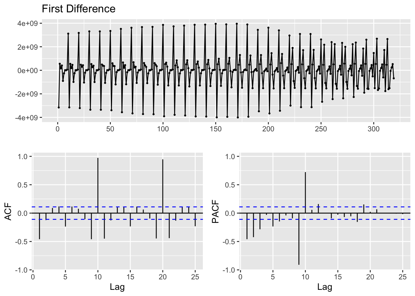
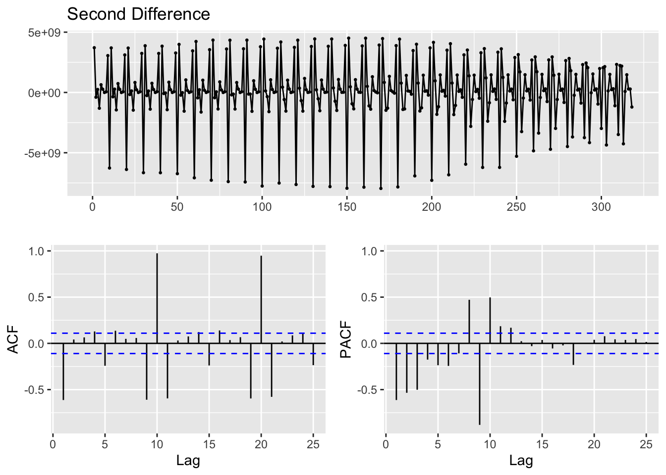
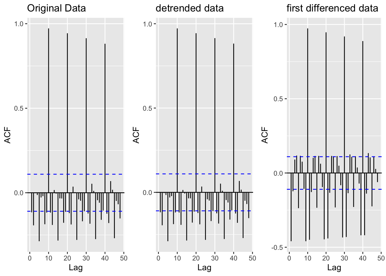
The original data was already fairly stationary - as de-trending the data didn’t change the lagged correlations at all. Correlations still exist for lags every 5 years (very cyclical), but the data has a constant mean and variance across time making it at least weakly stationary. Differencing was performed to see how the data would behave - and it was likely unnecessary given that the original data was already stationary.
5) Augmented Dickey-Fuller Test
ADF is used to check that the data is stationary
    Augmented Dickey-Fuller Test

data:  energy_sources$Output
Dickey-Fuller = -13.743, Lag order = 6, p-value = 0.01
alternative hypothesis: stationary
The Augmented Dickey-Fuller tests are used to assess how stationary the data is. An ADF test of all energy production outputs produced a p-value of 0.01. Thus, we can reject the null hypothesis of no stationarity at the 1% level - indicating that this series does in fact exhibit stationarity. This aligns with findings from the ACF plots above.
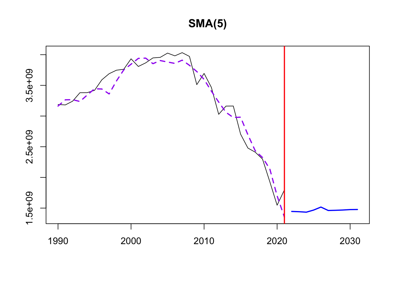
6) Moving Average Smoothing
This smoothing helps identify underlying patterns, especially because of the lack of seasonality in the data. Three different MA windows for smoothing are selected: 5,10,20.
The order of SMA tells us the number of data points used to calculate the moving average. Thus, a window of 5 will be more responsive to short-term fluctuations and exhibit more details of the trend over a shorter time frame. An order of 20 is far smoother, and less responsive to year to year events.
Time elapsed: 0.22 seconds
Model estimated using sma() function: SMA(5)
Distribution assumed in the model: Normal
Loss function type: MSE; Loss function value: 2.623999e+16
ARMA parameters of the model:
AR:
phi1[1] phi2[1] phi3[1] phi4[1] phi5[1]
    0.2     0.2     0.2     0.2     0.2

Sample size: 32
Number of estimated parameters: 3
Number of degrees of freedom: 29
Information criteria:
     AIC     AICc      BIC     BICc
1306.606 1307.463 1311.003 1312.488 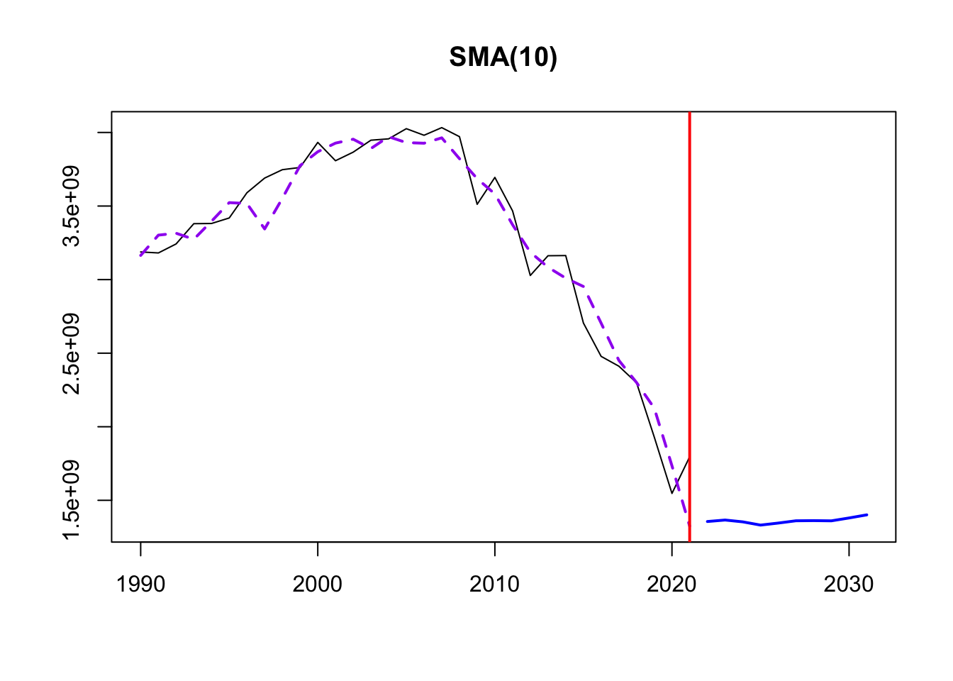
Time elapsed: 0.21 seconds
Model estimated using sma() function: SMA(10)
Distribution assumed in the model: Normal
Loss function type: MSE; Loss function value: 2.472111e+16
ARMA parameters of the model:
AR:
 phi1[1]  phi2[1]  phi3[1]  phi4[1]  phi5[1]  phi6[1]  phi7[1]  phi8[1]
     0.1      0.1      0.1      0.1      0.1      0.1      0.1      0.1
 phi9[1] phi10[1]
     0.1      0.1

Sample size: 32
Number of estimated parameters: 3
Number of degrees of freedom: 29
Information criteria:
     AIC     AICc      BIC     BICc
1304.698 1305.555 1309.095 1310.581 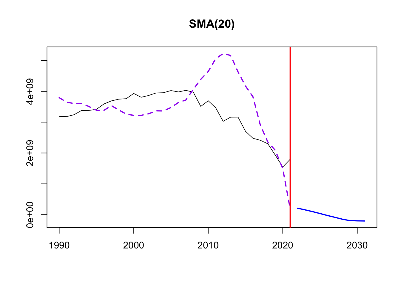
Time elapsed: 0.53 seconds
Model estimated using sma() function: SMA(20)
Distribution assumed in the model: Normal
Loss function type: MSE; Loss function value: 8.031173e+17
ARMA parameters of the model:
AR:
 phi1[1]  phi2[1]  phi3[1]  phi4[1]  phi5[1]  phi6[1]  phi7[1]  phi8[1]
    0.05     0.05     0.05     0.05     0.05     0.05     0.05     0.05
 phi9[1] phi10[1] phi11[1] phi12[1] phi13[1] phi14[1] phi15[1] phi16[1]
    0.05     0.05     0.05     0.05     0.05     0.05     0.05     0.05
phi17[1] phi18[1] phi19[1] phi20[1]
    0.05     0.05     0.05     0.05

Sample size: 32
Number of estimated parameters: 3
Number of degrees of freedom: 29
Information criteria:
     AIC     AICc      BIC     BICc
1416.085 1416.942 1420.482 1421.967
From this exploration, it seems that SMA with an order of 10 smoothing is the best for the data. The yearly data required a fairly small order for smoothing given the sparse nature of the data points. A window of 10 minimized the information criteria (AIC, BIC, AICc) and provided the best smoothing of data fluctuations and view into the underlying trends. From this we can see that the trend in electricity production is steadily increasing between 1990 -1995 before beginning a slow descent down to 2005.
Dataset 2 - Petroleum Exports vs. Imports
1) Identify time series components of data
Below is the unaltered time series. The data contains Petroleum Imports, Exports, and Total Field Production in thousands of barrels per day between 1990 and 2022.
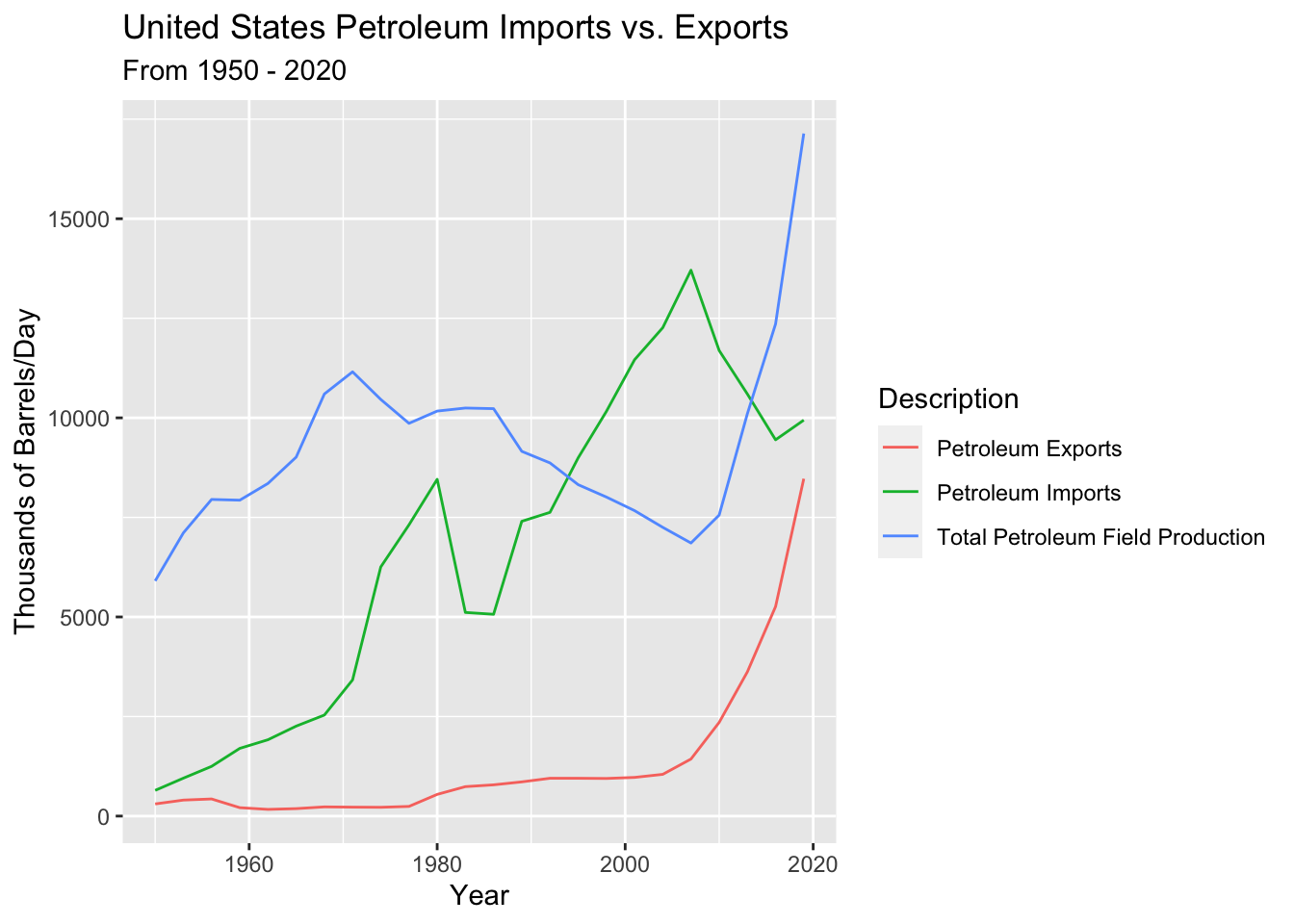
Initial examination of the data suggests that petroleum imports and exports both trended upwards, likley in response to energy usage and dependence in the U.S. increasing over the time interval. Total petroleum field production may also trend upwards - although there is more randomness to its behavior. Only annual data is available - hence seasonality cannot be surmised here, but there may be some slight cyclicality to petroleum exports. Furthermore, it’s plausible that petroleum imports may be tied to the economy and grow during bull and crash during bear markets; however, further examination is needed to assess this hypothesis.
2) Lag Plots
Lag plots are again used to examine autocorrelation between the time series and itself - i.e. do current petroleum imports and exports impact future petroleum imports and exports?
1 Year, 2 Year, 10 Year, 20 Year Lags in Petroleum Imports
1 Year, 2 Year, 10 Year, 20 Year Lags in Petroleum Exports
1 Year, 2 Year, 10 Year, 20 Year Lags in Petroleum Total Field Production
Petroleum imports show weak autocorrelation with lags 1, 2 and 10 - weakening over time. By lag 20 there is no correlation between the time series and the lagged values (it’s just random). Petroleum exports show stronger autocorrelation with lags 1 and 2, while the lagged values at lags 10 and 20 are random and not correlated with the time series. Petroleum total field production shows no autocorrelation with itself across any lag period.
We can explain these results with intuition: Petroleum imports and exports are largely dependent on foreign policy, international crises, domestic policy affecting drilling permits, and supply and demand for petroleum. These external factors play a much larger role in determining imports and exports than previous years’ values of imports and exports. There is a weak correlation between lag 1 and 2 as often the same external factors (i.e. policy or crisis) are in play for multiple years and therefore closely grouped years exhibit similar behavior. But this explains why there is very little correlation with lagged period greater than 2 years.
3) Decompose Data
The data cannot be decomposed because it does not exhibit seasonality. See SMA (Simple moving average) below for more information on its behavior.
4) ACF/PACF Plots
Detrending
None of the series exhibit stationarity so detrending must be undertaken for all three.
[1] "Original import data vs. detrended import data"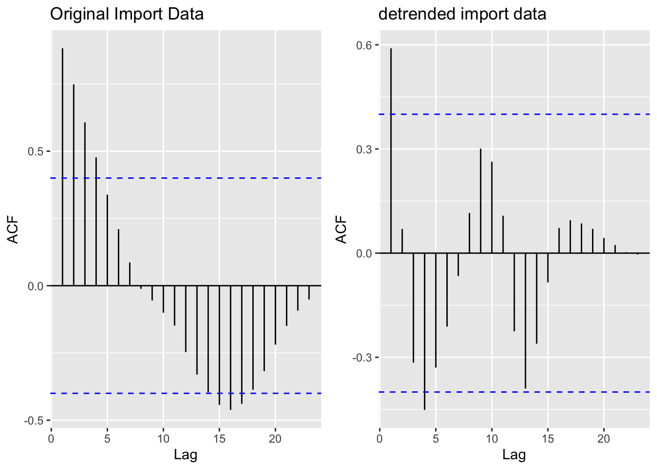
[1] "Original export data vs. detrended export data"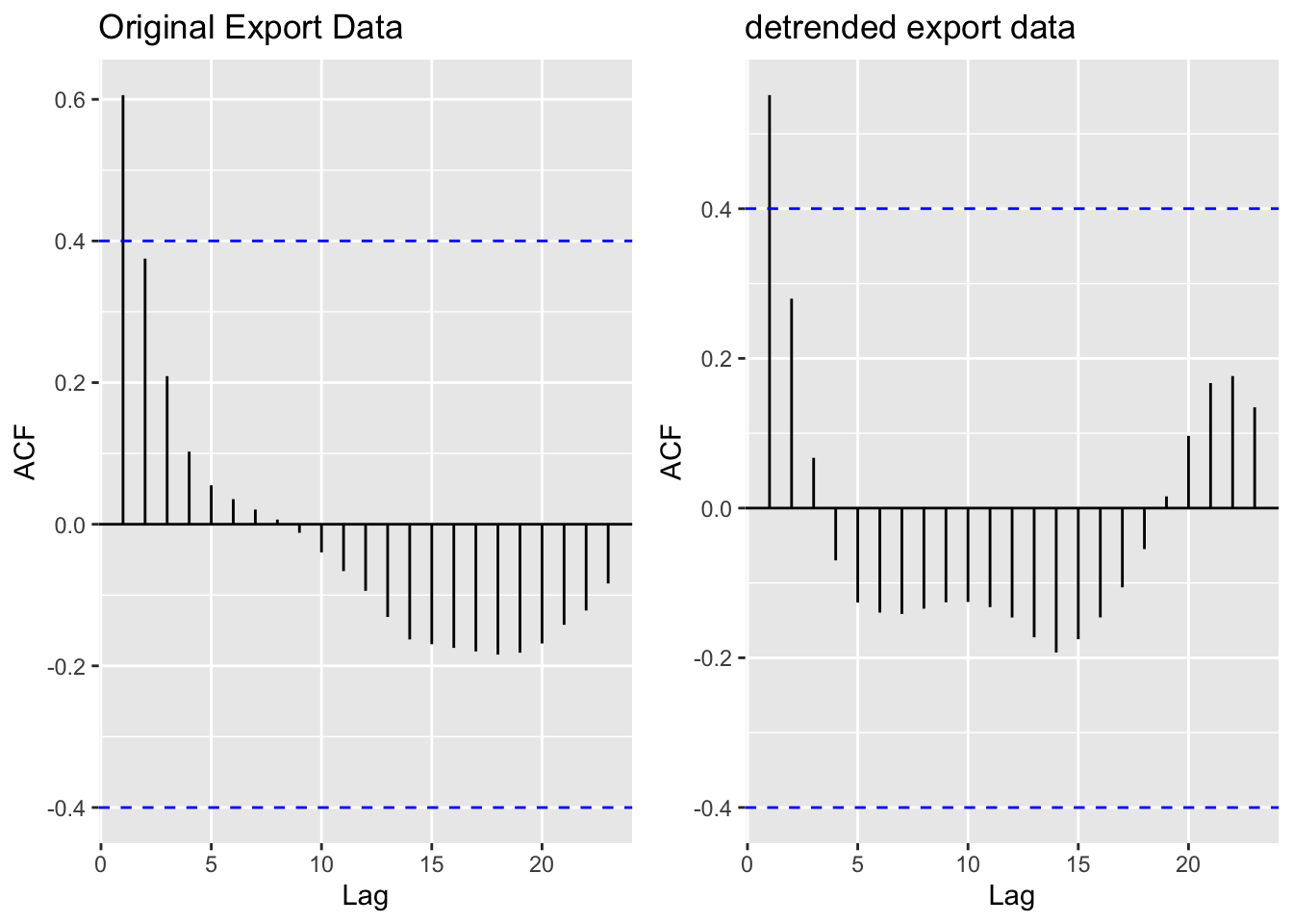
[1] "Original field production data vs. detrended field production data"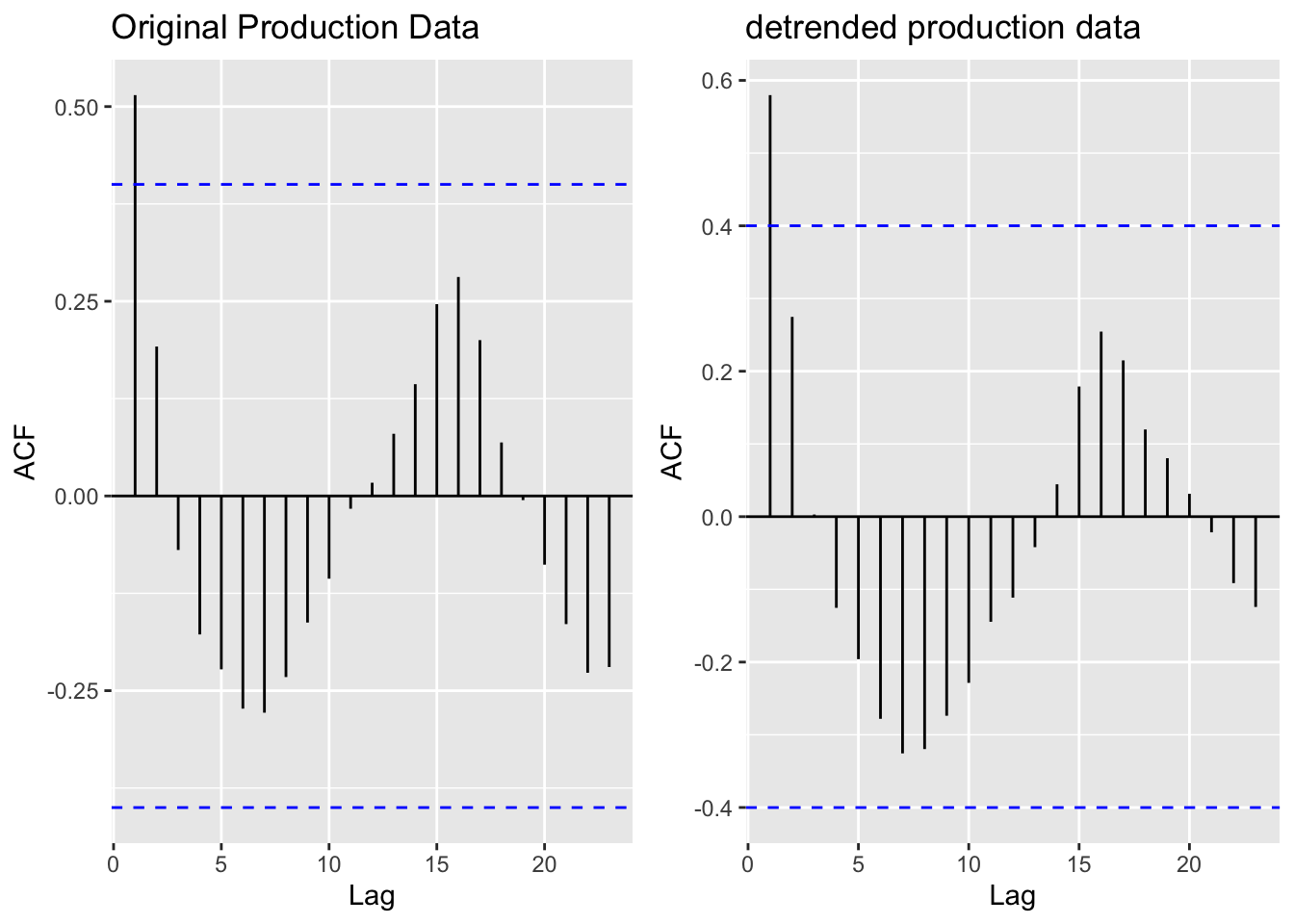
The ACF and PACF plots for Imports, Exports, and Production Totals illustrate that the data does actually have some seasonality given the sinusoidal curves demonstrated across all three. Detrending imports eliminated autocorrelation between the time series and lags 2,3, and 4. Interestingly, detrending export and production did not significantly change the correlations across lags - which is especially bizarre given that the ADF Tests (below) return extremely high p values - meaning we strongly fail to reject the null hypothesis of no stationarity.
5) Augmented Dickey-Fuller Test
We mathematically examine stationarity of Imports, Exports, and Production data using the ADF Test on detrended data below.
    Augmented Dickey-Fuller Test

data:  resid(fit_import)
Dickey-Fuller = -2.7874, Lag order = 2, p-value = 0.2724
alternative hypothesis: stationary
    Augmented Dickey-Fuller Test

data:  resid(fit_export)
Dickey-Fuller = 2.8814, Lag order = 2, p-value = 0.99
alternative hypothesis: stationary
    Augmented Dickey-Fuller Test

data:  resid(fit_prod)
Dickey-Fuller = -0.60931, Lag order = 2, p-value = 0.9659
alternative hypothesis: stationary
Even after detrending the data does not exhibit stationarity via the ADF test! Thus, differencing is used to generate stationary data.
Differencing Imports, Exports, and Production –> ADF Test
Log() transformations are employed on Exports and Production data due to the high degrees of non-stationarity.
Imports

    Augmented Dickey-Fuller Test

data:  import$Value %>% diff() %>% diff()
Dickey-Fuller = -3.6065, Lag order = 2, p-value = 0.04954
alternative hypothesis: stationary
Exports
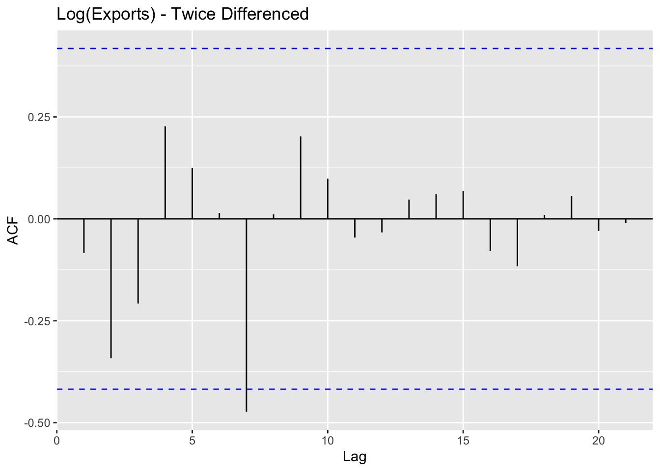
    Augmented Dickey-Fuller Test

data:  log(export$Value) %>% diff() %>% diff()
Dickey-Fuller = -4.5144, Lag order = 2, p-value = 0.01
alternative hypothesis: stationary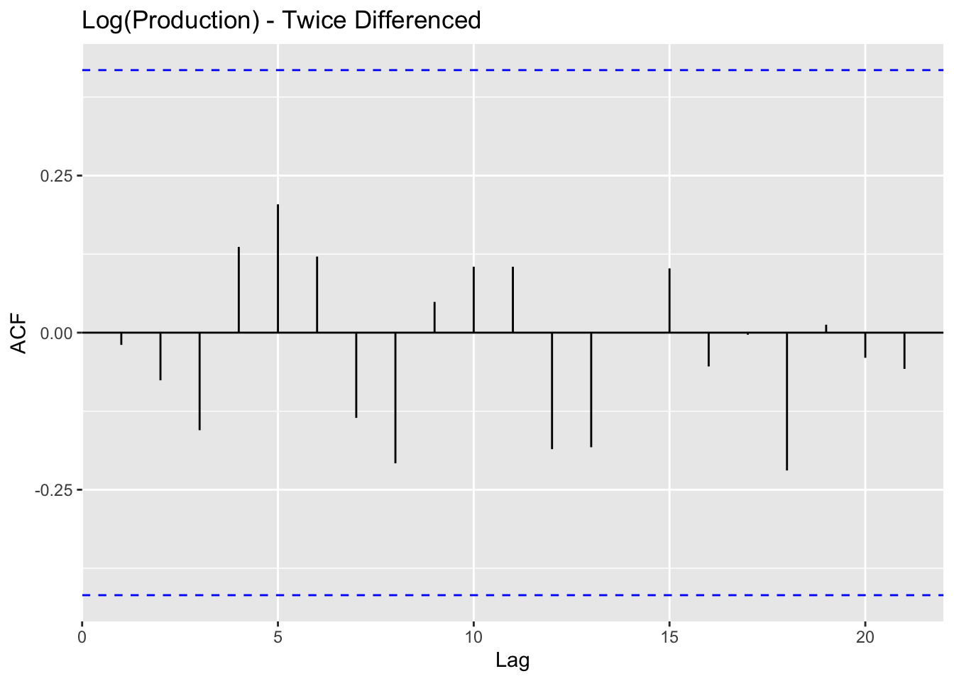
    Augmented Dickey-Fuller Test

data:  log(production$Value) %>% diff() %>% diff()
Dickey-Fuller = -4.0549, Lag order = 2, p-value = 0.02134
alternative hypothesis: stationary
Finally, after using log() transformations on Exports and Production data, and twice differencing all three series - stationarity is achieved. This data has a strong upwards trends and lack of cyclicality and seasonality - making it complicated to coerce into stationary behavior.
6) Moving Average Smoothing
This smoothing helps identify underlying patterns, especially because of the lack of seasonality in the data. Three different MA windows for smoothing are selected: 3,5,10.

Time elapsed: 0.03 seconds
Model estimated using sma() function: SMA(3)
Distribution assumed in the model: Normal
Loss function type: MSE; Loss function value: 3087529
ARMA parameters of the model:
AR:
phi1[1] phi2[1] phi3[1]
 0.3333  0.3333  0.3333

Sample size: 24
Number of estimated parameters: 2
Number of degrees of freedom: 22
Information criteria:
     AIC     AICc      BIC     BICc
430.7382 431.3096 433.0943 434.0023 
Time elapsed: 0.02 seconds
Model estimated using sma() function: SMA(5)
Distribution assumed in the model: Normal
Loss function type: MSE; Loss function value: 4514177
ARMA parameters of the model:
AR:
phi1[1] phi2[1] phi3[1] phi4[1] phi5[1]
    0.2     0.2     0.2     0.2     0.2

Sample size: 24
Number of estimated parameters: 2
Number of degrees of freedom: 22
Information criteria:
     AIC     AICc      BIC     BICc
439.8547 440.4261 442.2108 443.1188 
Time elapsed: 0.03 seconds
Model estimated using sma() function: SMA(10)
Distribution assumed in the model: Normal
Loss function type: MSE; Loss function value: 7834077
ARMA parameters of the model:
AR:
 phi1[1]  phi2[1]  phi3[1]  phi4[1]  phi5[1]  phi6[1]  phi7[1]  phi8[1]
     0.1      0.1      0.1      0.1      0.1      0.1      0.1      0.1
 phi9[1] phi10[1]
     0.1      0.1

Sample size: 24
Number of estimated parameters: 2
Number of degrees of freedom: 22
Information criteria:
     AIC     AICc      BIC     BICc
453.0849 453.6563 455.4410 456.3490
SMA was again used to remove noise and identify trends in the petroleum exports vs imports data. From examination of a few different SMA windows (3,5,10), order 5 is selected. From this it’s clear that petroleum imports and exports have trended up throughout the time period of examination and the major spikes and dips in production have been smoothed out.
Dataset 3 - Cost of Energy
For this dataset, I examine the total cost of energy across multiple sources: coal, natural gas, biomass, petroleum, wind, etc.
1) Identify time series components of data
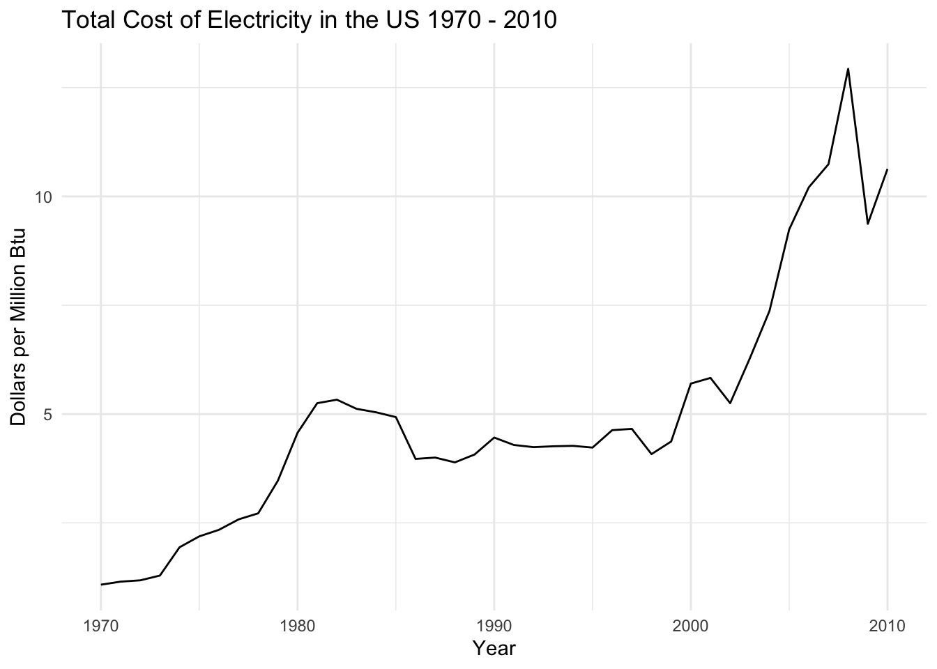
The basic time series plot of total cost of electricity in the US shows some interesting patterns. There’s a definite upwards trend due to inflation and rising cost of goods and services, as well as some fluctuations that appear to be cyclical. It doesn’t look like there’s much seasonality in this data but the cyclicality will be examined.
The cost of electricity had a local peak in 1983 - during the oil crisis in the US - and then again began to rise exponentially in the early 2000s. This coincided with the US’ maximum petroleum imports and the rise of natural gas as the dominent energy source. The cost of electricity dropped in 2008 due to the global financial crisis, and then steadily rose until the end of the timeframe examined (2010).
2) Lag Plots
1 Year, 2 Year, 10 Year, 20 Year Lags in Petroleum Imports
There is a weak correlation between the time series and lag 1, and an even weaker correlation with lag 2. Values at lags 10 and 20 don’t appear to be correlated with the time series at all. This is somewhat surprising, as the cost of electricity is tied to external factors (such as global fuel supply) but prices are also tied to the US economy which is highly cyclical. I expected the 10 and 20 year lags to be correlated to the time series due to economic cycles but that does not appear in the data.
3) Decompose data
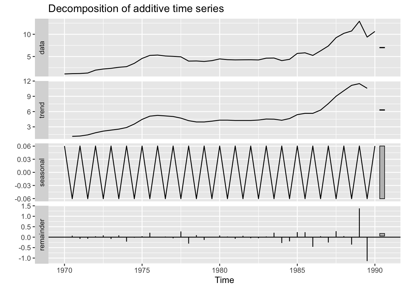
Through decomposition of the time series, a more concrete idea of the trend and seasonality appears. The data is indeed trending upwards, with a spike in the early 2000s and a crash during the 2008 financial crisis. There is some seasonal variation - and it is certainly additive based on the decomposition plot.
4) ACF/PACF Plots
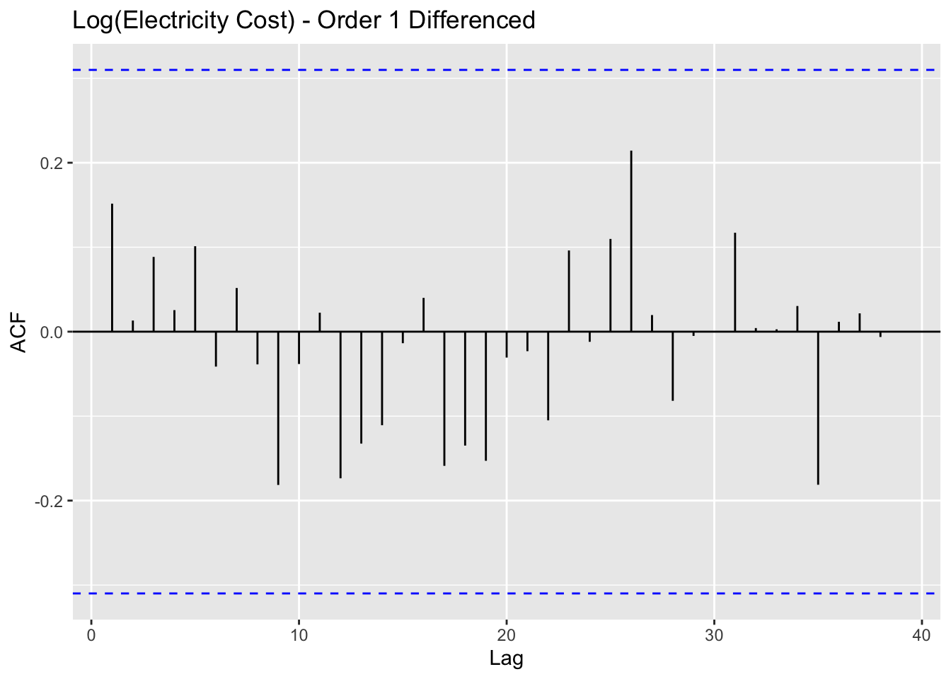
Again, this data is certainly not stationary so de-trending is potentially helpful. ACF/PACF plots are compared for both the original and de-trended data.
[1] "Original electricity cost data vs. detrended electricity cost data"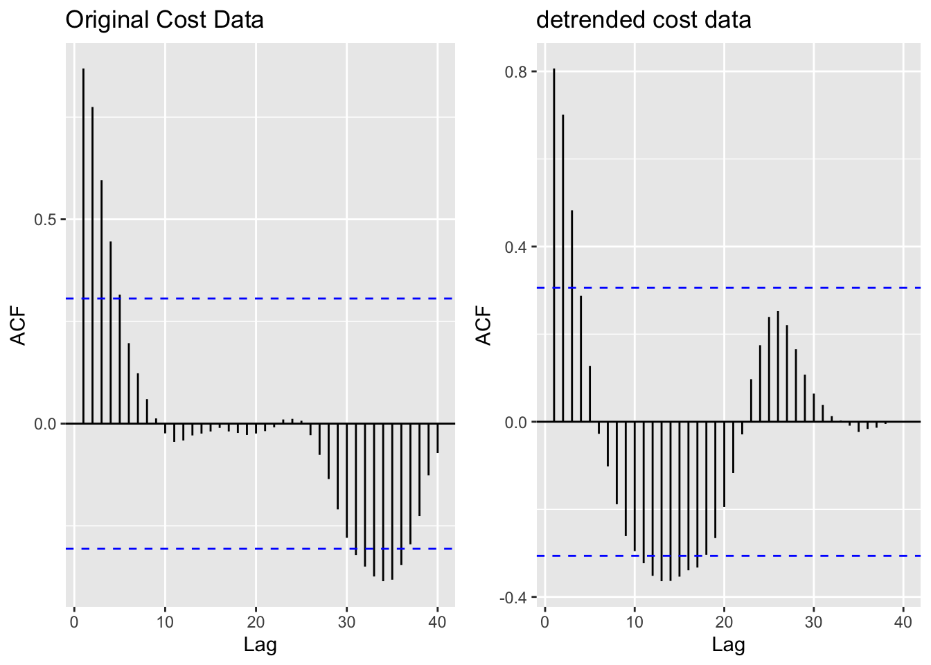
The data is clearly not stationary, as there is a gradual weakening of the correlation with lagged values until lag 10, and then a large spike of negatively correlated lagged values around lags 30-40. This negative correlation is reflective of the strong upward trend over time as well as the exponential price growth in the early 2000s. The mean, variance, and autocorrelation pattern are not consistent over time and therefore the data does not have stationarity.
To address this, I tried basic detrending mechanisms, but this did not coerce the data into stationarity. The ADF Test below confirms this. Thus, differencing was undertaken to achieve the desired stationary behavior.
5) Augmented Dickey-Fuller Test
    Augmented Dickey-Fuller Test

data:  resid(fit_cost)
Dickey-Fuller = -2.4232, Lag order = 3, p-value = 0.4071
alternative hypothesis: stationary
With a p-value of 0.4071, we fail to reject the null hypothesis that the detrended data doesn’t have stationarity.
    Augmented Dickey-Fuller Test

data:  log(import$Value) %>% diff()
Dickey-Fuller = -3.7192, Lag order = 2, p-value = 0.04149
alternative hypothesis: stationary
In order to coerce the cost of electricity data into having stationary properties, the data is transformed via log() and then differenced once. After transformation and differencing, the ACF plot indicates no lags that are statistically significantly correlated with the time series and the mean, variance, and autocorrelation function behavior are constant over time.
Additionally, now the ADF test returns a p value of 0.04149 which is statistically significant at the 5% level. Thus, we can now reject the null hypothesis that the data is not stationary and proceed with future modeling.
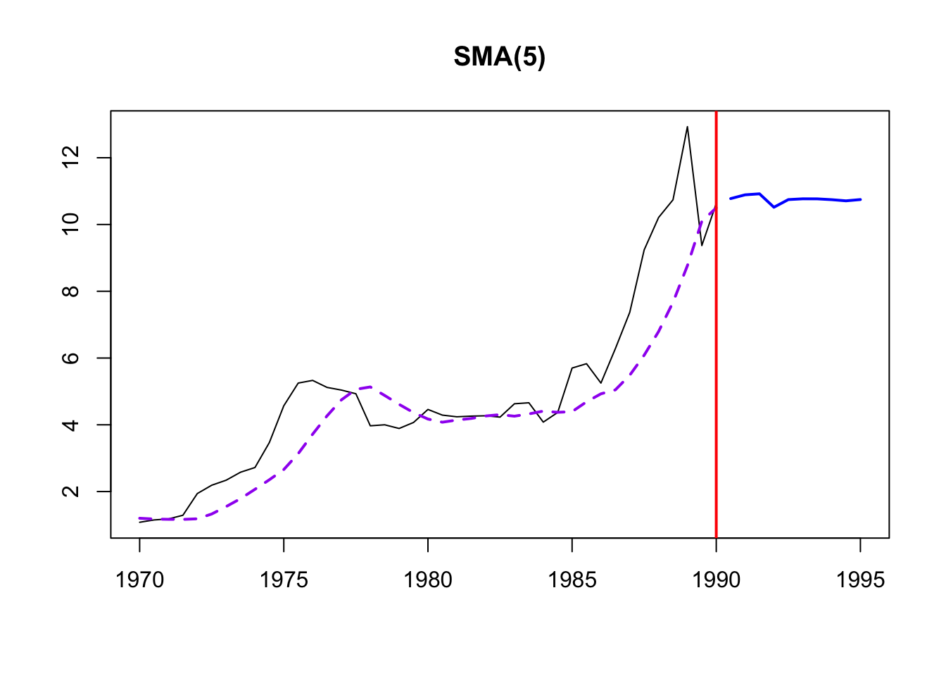
6) Moving Average Smoothing
This smoothing helps identify underlying patterns, especially because of the lack of seasonality in the data. Three different MA windows for smoothing are selected: 3,5,10.
Time elapsed: 0 seconds
Model estimated using sma() function: SMA(5)
Distribution assumed in the model: Normal
Loss function type: MSE; Loss function value: 1.8573
ARMA parameters of the model:
AR:
phi1[1] phi2[1] phi3[1] phi4[1] phi5[1]
    0.2     0.2     0.2     0.2     0.2

Sample size: 41
Number of estimated parameters: 0
Number of degrees of freedom: 41
Information criteria:
     AIC     AICc      BIC     BICc
141.7371 141.7371 141.7371 141.7371 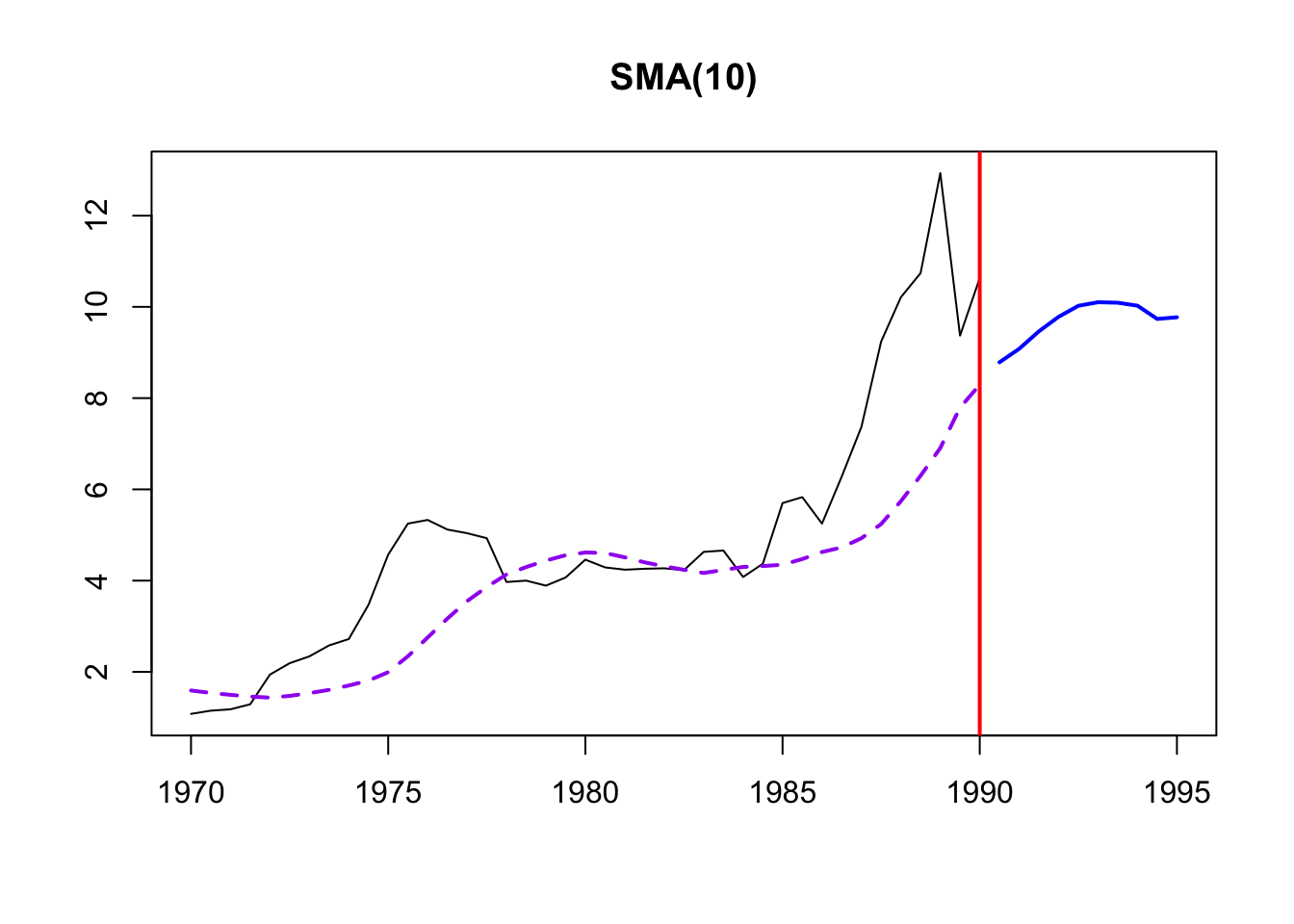
Time elapsed: 0.01 seconds
Model estimated using sma() function: SMA(10)
Distribution assumed in the model: Normal
Loss function type: MSE; Loss function value: 3.6406
ARMA parameters of the model:
AR:
 phi1[1]  phi2[1]  phi3[1]  phi4[1]  phi5[1]  phi6[1]  phi7[1]  phi8[1]
     0.1      0.1      0.1      0.1      0.1      0.1      0.1      0.1
 phi9[1] phi10[1]
     0.1      0.1

Sample size: 41
Number of estimated parameters: 0
Number of degrees of freedom: 41
Information criteria:
     AIC     AICc      BIC     BICc
169.3311 169.3311 169.3311 169.3311 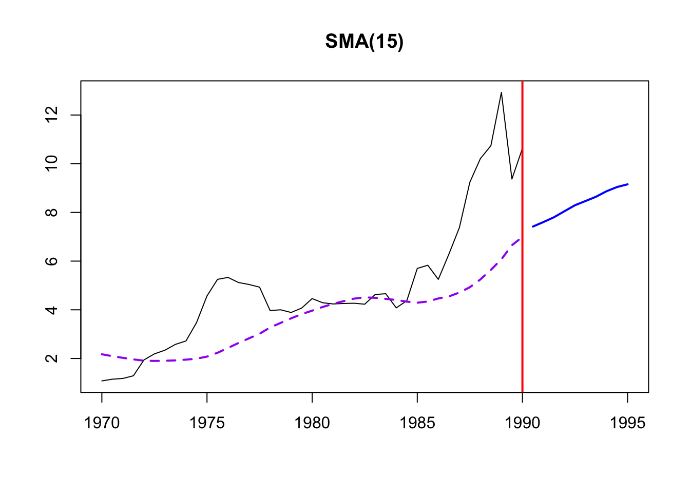
Time elapsed: 0.01 seconds
Model estimated using sma() function: SMA(15)
Distribution assumed in the model: Normal
Loss function type: MSE; Loss function value: 4.8375
ARMA parameters of the model:
AR:
 phi1[1]  phi2[1]  phi3[1]  phi4[1]  phi5[1]  phi6[1]  phi7[1]  phi8[1]
  0.0667   0.0667   0.0667   0.0667   0.0667   0.0667   0.0667   0.0667
 phi9[1] phi10[1] phi11[1] phi12[1] phi13[1] phi14[1] phi15[1]
  0.0667   0.0667   0.0667   0.0667   0.0667   0.0667   0.0667

Sample size: 41
Number of estimated parameters: 0
Number of degrees of freedom: 41
Information criteria:
     AIC     AICc      BIC     BICc
180.9856 180.9856 180.9856 180.9856
SMA was again used to remove noise and identify trends in the cost of energy. From examination of a few different SMA windows (5,10,15), order 10 is selected. From this it’s clear that electricity prices have trended up throughout the time period of examination and the major spikes and dips in production have been smoothed out.
Dataset 4 - CO2 Emissions
For this dataset, I examine CO2 emissions by month since 1973. I focus on 4 emissions sources: Coal, Hydrocarbon Gas, Natural Gas, and Petroleum.
1) Identify time series components of data
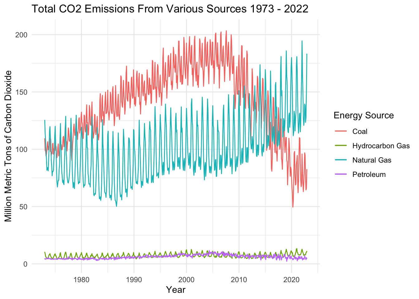
The basic time series plot of total CO2 emissions by source shows some interesting patterns. Emissions from all four sources exhibit seasonality, probably because people use more fuel in the summer when it’s hot and ACs are running. Coal saw an upward trend from 1973-2007, and has since trended downwards. Natural gas trends upwards, overtaking coal as the leading emissions source in the middle 2010s. Hydrocarbon and Petroleum are both minor contributors to US CO2 emissions relative to Coal and Natural Gas - but they may exhibit slight seasonality as well.
2) Lag Plots
Examining lags in time series data highlights any potential correlations between steps along the time interval –> i.e. is energy production at time t correlated with energy production at time t-1? Does the previous year’s energy production impact energy production in future years (e.g. perhaps because of investments made in infrastructure or the passage of legislation that would affect production). Lag plots also help to understand any potential seasonality in the data.
1 month, 6 month, 1 year, 5 year Lags in Coal CO2 Emissions
1 month, 6 month, 1 year, 5 year Lags in Hydrocarbon Gas CO2 Emissions
1 month, 6 month, 1 year, 5 year Lags in Petroleum Gas CO2 Emissions
1 month, 6 month, 1 year, 5 year Lags in Natural Gas CO2 Emissions
In coal production, there’s a weak autocorrelation between the data and a 1 month lag, indicating that there is some connection between month to month production but other factors may play a larger role. Lags 6 and 60 are essentially random; thus, it’s likely that there isn’t a correlation between the time series data and 6 month effects or lags farther away. Lag 12 shows the strongest correlation - indicating that there’s a strong relationship in CO2 emissions from coal on a yearly basis.
Emissions from hydrocarbon gas are strongly correlated with 1 month lag, 6 month lag, and 12 month lag. This indicates that there are strong seasonal effects year to year in emissions/usage of Natural Gas, as well as trends upwards over time in NatGas usage that lead to correlations month to month as well.
Petroleum Gas exhibited very weak correlations across lags examined. Even the 1 month and 1 year lags were only weakly autocorrelated so there may be less seasonality at play with emissions here.
Finally, Natural gas is HIGHLY correlated across lats. Lag 12 (1 year lag) shows a very strong relationship with the time series, with lag 60 (5 year lag) showing another strong relationship. On the other hand, lag 6 is almost randomly related to the time series, so seasonal effects are strong here.
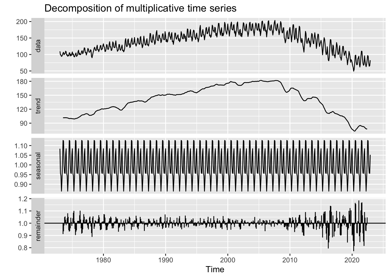
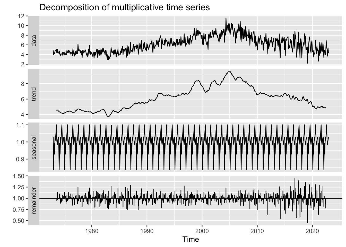
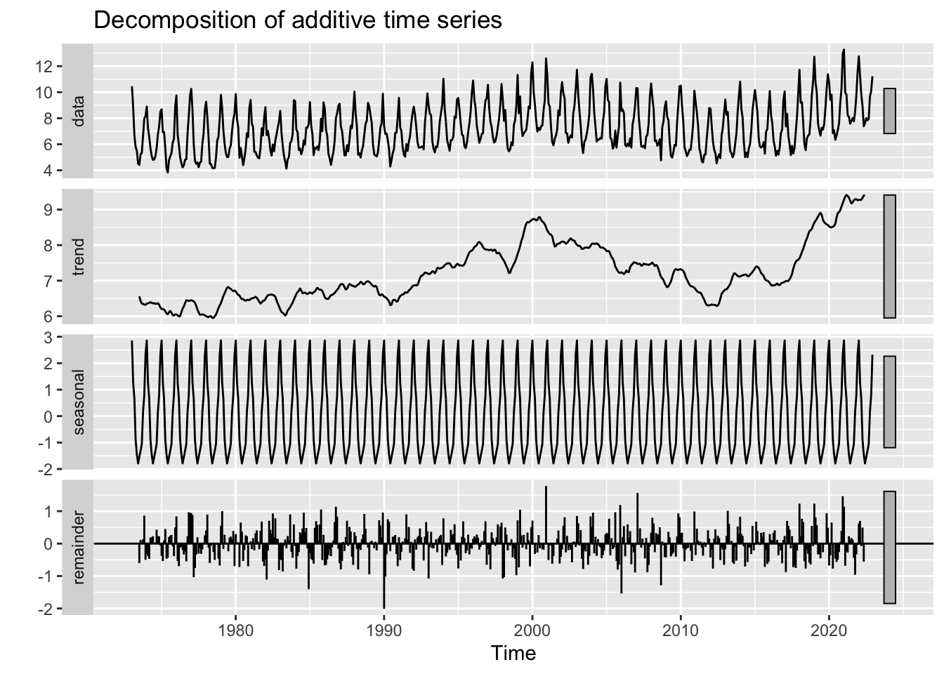
3) Decompose data
CO2 Emissions from Coal
CO2 Emissions from Petroleum
CO2 Emissions from Hydrocarbon gas
CO2 Emissions from Natural Gas
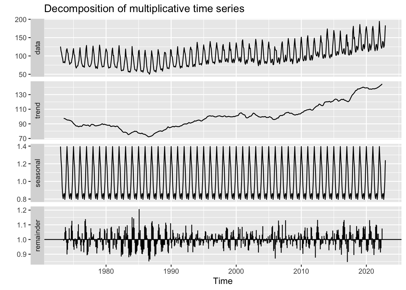
This is the first dataset to truly exhibit seasonal effects. CO2 emissions across all four fuel sources exhibit either multiplicative or additive seasonality, indicating that fuel usage and correlated CO2 emissions are highly periodic and tied to human behavior. In hot months, emissions increase and in cold months they tend to decrease. For 3/4 fuel sources, these seasonal swings are increasing over time, while for hydrocarbon gas these swings are constant over time.
4) ACF/PACF Plots
Note: Now, with a sense of how these different fuel sources impact CO2 emissions we will be model building and forecasting using Total CO2 Emissions. In a final review, I may dive into individual forecasts if necessary.
Autocorrelation Function (ACF) and Partial Autocorrelation Function (PACF) plots are useful for showing the correlation coefficients between a time series and its own lagged values. ACF looks at the time series and previous values of the series measured for different lag lengths - while PACF looks directly at the correlation between a time series and a given lag. Both are also useful for identifying if the data has stationarity - where the mean, variance, and autocorrelation structure do not change over time.
Before building ACF/PACF plots the data is logged and differenced - to examine seasonality and cyclicality directly. Differencing occurs by subtracting the previous observation from the current observation to remove temporal dependence.
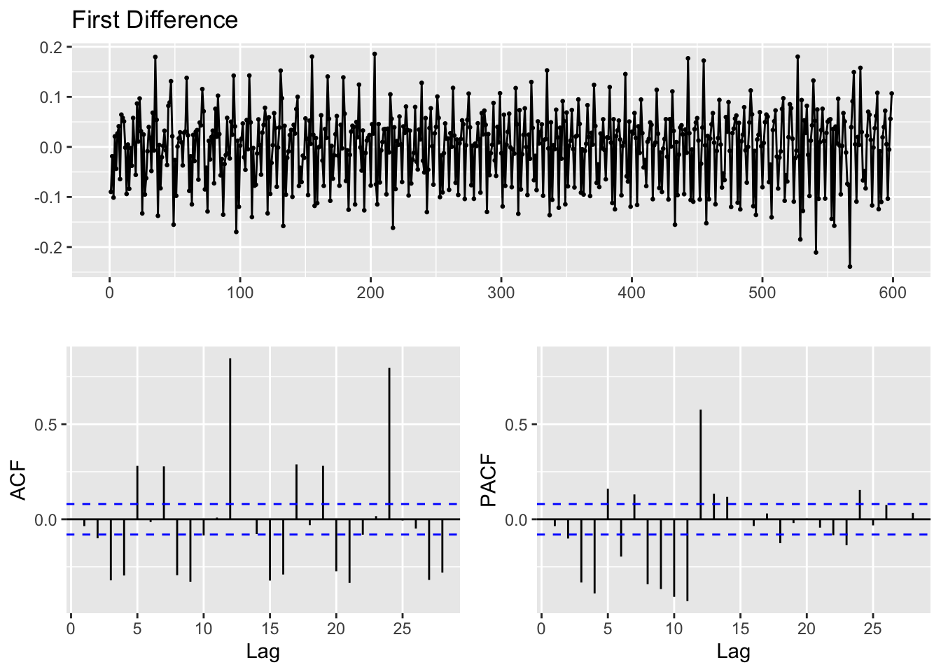
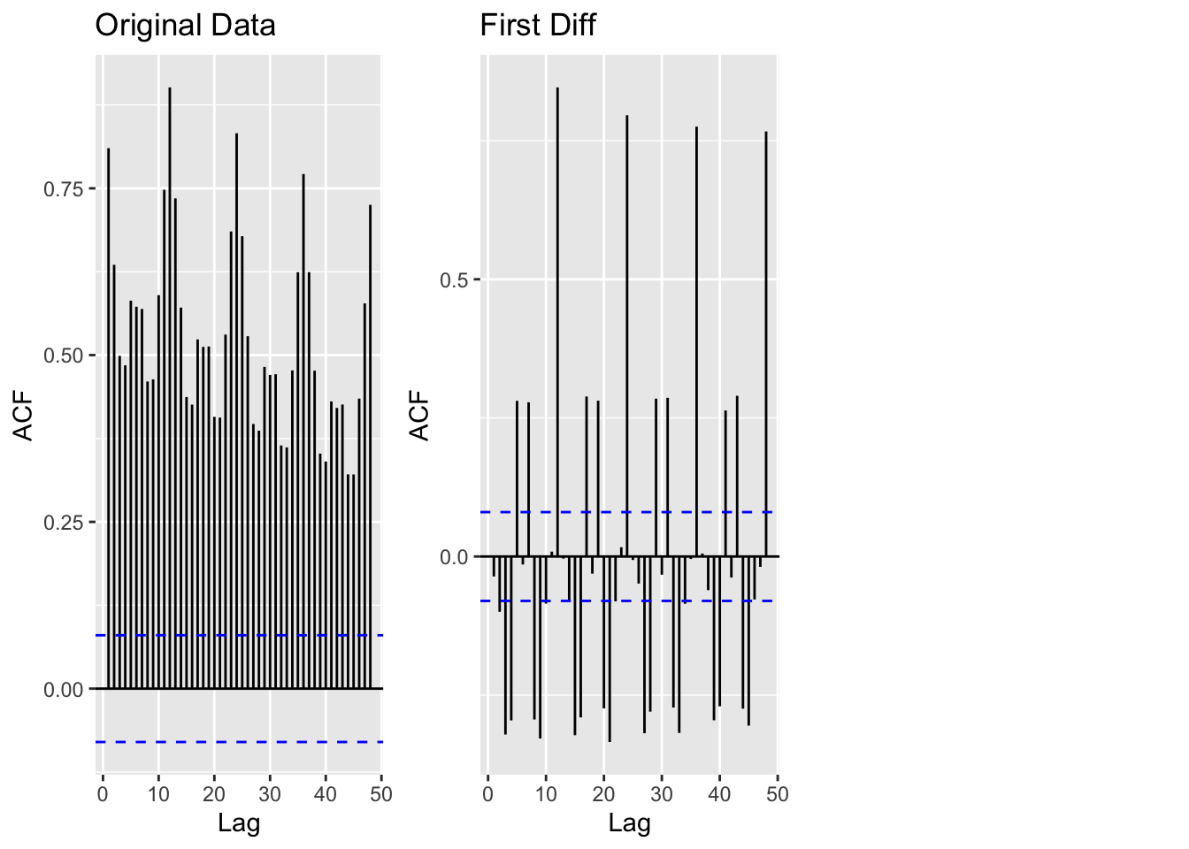
The original data was highly non-stationary - and required logging the value of CO2 emissions, and one difference. Two differences would have overdifferenced and overcomplicated the data. Additionally, with one difference the ADF test below returns a p-value of 0.05. There are still correlated lags at 6,12,24 but those will be explored during model diagnostics.
5) Augmented Dickey-Fuller Test
ADF is used to check that the data is stationary
    Augmented Dickey-Fuller Test

data:  total$log_value %>% diff()
Dickey-Fuller = -18.926, Lag order = 8, p-value = 0.01
alternative hypothesis: stationary
The Augmented Dickey-Fuller tests are used to assess how stationary the data is. An ADF test of all energy production outputs produced a p-value of 0.01. Thus, we can reject the null hypothesis of no stationarity at the 1% level - indicating that this series does in fact exhibit stationarity now.
Source code for the above analysis: Github