Data Viz

Data Visualization is the first step to understanding the major trends and patterns in our data. Before modeling or analyzing the data sources collected on the Data Sources page, we visualize key questions around energy production, consumption, and cost in the United States using Plotly, ggplot, and Tableau.
Plot 1 - Total Electricity Production Across Fuel Sources
Source: EIA.gov
The Energy Information Administration provides data on total electricity production broken down by state and fuel source between 1990 and 2022. State totals are aggregated so show national trends of different fuel sources over time. The fuel sources are comprised of sustainable energy sources such as wind, solar, geothermal, as well as dirtier energy like coal and petroleum. In 1990, coal was by far the leading fuel source nationwide at 3.2 billion Megawatthours produced. Solar was the smallest fuel sector at only 700,000 Megawatthours produced. Throughout the next decade, most fuel sources trended upwards as the population grew and generated an increased demand for electricity. Coal production peaked in 2007 at 40 billion Megawatthours before beginning a steady decline down to its lowest in 2020 at 1 billion Megawatthours.
2008 marked a shift in electricity production away from coal towards natural gas, which overtook coal as the most abundant fuel source in 2015. Other cleaner energy sources, such as wind and solar, started to see notable growth as early as 2010, likely in response to growing public awareness of climate change.
Plot 2 - Energy Production by State
Source: EIA.gov
In order to break down which states are the largest producers of electricity - and therefore which states should be the focus of energy security and resilience efforts - electricity production by state is visualized. Between 1990 - 2022, the electricity production of each state is visualized and stacked against each other, ranked from most to least. The largest producer is by far Texas at 480 million Megawatt Hours in 2022. Texas is the only state with its own power grid, making it even more vulnerable to future meltdowns. Given the failure of the Texas grid in 2022, this makes Texas a great state to prioritize for electric grid resilience projects.
After Texas, Pennsylvania is #2 at only 246 million Megawatt Hours in 2022, with Florida and California close behind at 240 and 197 million Megawatt Hours, respectively.
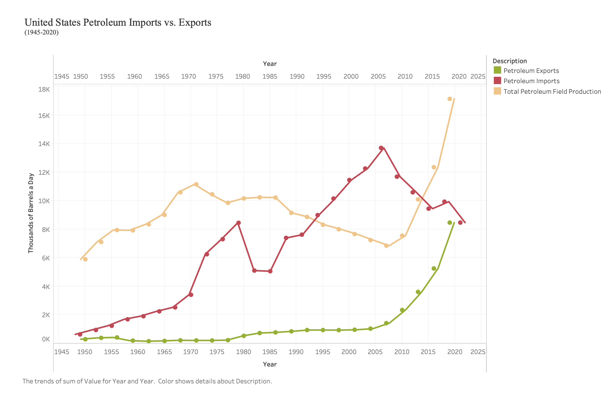
Plot 3 - Petroleum Exports vs. Imports
Source: Table 3.1 Petroleum Overview
This plot was generated using Tableau.
 A key indicator of energy resilience is the ratio of imports and exports of different fuels. Plot 3 examines Petroleum imports and exports in the U.S. between 1945 to 2022, as well as total petroleum field production. The Council on Foreign Relations offers a complete and thorough timeline of the U.S.’ dependence on oil and how it affects foreign relations - which helps explain some of the trends seen in the chart above.
Petroleum exports (green) were constant until about 1980, when a slow upward trend began and then turned into exponential growth in 2005. The 1980s uptick is due to the diversification of U.S. energy consumption when the Reagan administration deregulated crude oil prices in 1981. The rapid growth in 2005 parallels an uptick in total petroleum field production and the U.S.’ commitment towards energy independence.
Petroleum imports (red) have consistently been higher than exports over the last 80 years. Exports rose steadily in the 60s as a result of a legislative import quota, and then spiked in 1973 when the the import quota ended. Imports dropped in 1980 when Carter signed the Energy Security Act into law - which incentivized use of alternative fuel sources. Imports then grew over the next 30 years before dropping in 2007 as more national petroleum was produced and the US loosened its reliance on foreign petroleum.
Plot 4 - Cost of Energy Table 3.3 Consumer Price Estimates for Energy by Source, 1970-2010
Plot 4 examines how the cost of different fuel sources has changed over the past 40 years. Wider adoption of cleaner energy is contingent upon its competitiveness with traditional fossil fuels, making this a critical avenue of analysis. Coal, petroleum, and natural gas have all generally trended upwards since 1970, with coal moving from 38 cents/million Btu in 1970 to $2.42/million Btu in 2010. Natural gas has grown from 59 cents/million Btu to $7.67/million Btu in 2010. Petroleum has grown from $1.71 to $20.32/million Btu in the 30 year span. These price changes constitute a 536%, 1183%, and 1088% increase, respectively.
Cleaner fuels like biomass have grown 167% ($1.29 to $3.45/million Btu) while nuclear power grew 245% ($0.18 to $0.62/million Btu).
In 2010, the cheapest fuel source was easily nuclear power, with coal and biomass next in line. Thus, this analysis will pay particular attention to nuclear power; exploring the potential benefits and primary concerns surrounding this energy source.
Plot 5 - CO2 Emission Trends
Source code for the above analysis: Github